Representing Data using tables graphs and averages
Edited by Jamie (ScienceAid Editor), Taylor (ScienceAid Editor), SmartyPants


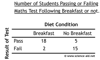
Tables
For Psychologists, tables are a very important tool. The title should be informative with the units stated clearly. The column titles should allow you to know exactly what the results show. Below is a table with the results from an experiment where students who had eaten breakfast, and students did not eat breakfast, did a maths test.

Graphs
Graphs are a good way of visually representing your findings in a study. The first one is a histogram. They are different to the bar charts because their scale is continuous (1,2,3,4,5 rather than red, blue and green), so the bars are put next to each other. In a 'proper' histogram, there is frequency density, but for the purposes of Psychology, we will only look at frequency which means the 'number of'.


Another type of graph that you may encounter is a scatter graph. This is done by plotting one thing against another, and will show a correlation. As well as a visual representation, there are a number of methods that we can use to calculate correlation numerically. A correlation of +1 would be perfect positive correlation and a correlation of -1 is perfect negative. Having a correlation of 0, would determine there is no relationship at all. The diagram below outlines this.


Averages and Distribution
Another term for average is measures of central tendency. So an average gives an indication as to the most typical result; there are three main types"
- 1- the one that appears the most.Mode - the most frequent piece of data - i.e.Advertisement
- 2Median.
- 3Mean.
The distribution of some data can also be called its spread. The easiest method is called the range and you simply subtract the smallest value from the largest. However, this is not entirely accurate. This is why statisticians have devised a measure called standard deviation. Put simply this measure tells you how much the data deviates (is smaller or larger than) the mean; on average. It is relative to the size of the mean.
Referencing this Article
If you need to reference this article in your work, you can copy-paste the following depending on your required format:
APA (American Psychological Association)
Representing Data using tables graphs and averages. (2017). In ScienceAid. Retrieved Apr 20, 2024, from https://scienceaid.net/psychology/approaches/representing.html
MLA (Modern Language Association) "Representing Data using tables graphs and averages." ScienceAid, scienceaid.net/psychology/approaches/representing.html Accessed 20 Apr 2024.
Chicago / Turabian ScienceAid.net. "Representing Data using tables graphs and averages." Accessed Apr 20, 2024. https://scienceaid.net/psychology/approaches/representing.html.
If you have problems with any of the steps in this article, please ask a question for more help, or post in the comments section below.
Comments
Article Info
Categories : Approaches
Recent edits by: Taylor (ScienceAid Editor), Jamie (ScienceAid Editor)
